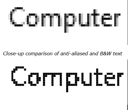
The typical computer screen has about 96 pixels or dots per inch (96dpi). At that resolution you would be able to see ragged edges to your text. Operating systems have a little trick to smooth out the edges, they add greyscale to the text. The text appears smoother and easier to read. Here are a couple of comparisons, they've been converted to greyscale, so that they are more relevant to screenprinting, actual screens use colours.
Anti-aliasing
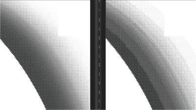
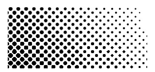
Good for screens, bad for screenprinting!